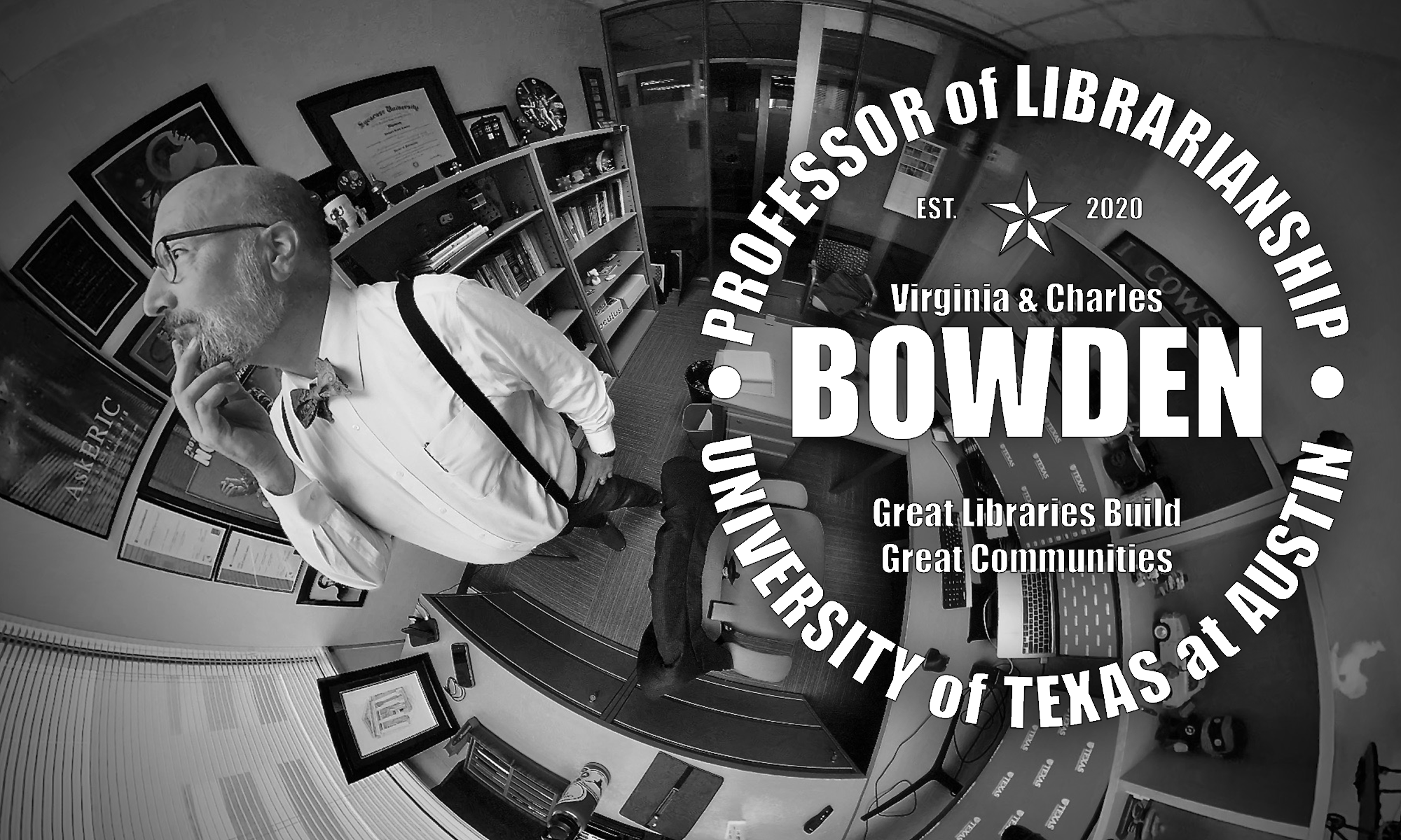
Welcome to the new look of my site. It is very different than my last configuration. All the content is still there. All the links still work. The main navigation menu under my big mug is exactly the same. It just gets rid of the more static front page.
To be honest it’s not as pretty as my former layout and the home page is not as good in highlight projects and presentations (sell those books!).
So why the change? Well the main issue was a hack that would repeatedly put links to viagra and college essay writing sites into my old theme. I got tired of trying to track down the injected code. Also, the previous site had a management overhead in making highlights and such. Now that I have, you know, a real job time is tight.
When I looked at my traffic it was coming from social media that sent out direct links (to say a presentation or blog post) or it was coming via a search engine to a direct page. So I did some simple user-based design.
If you hate it, let me know. Enough voices that actually care and I will put in the effort to spruce it up again. For now, enjoy the content.
Also, thanks to Jessamyn West I decided to throw up a couple of “hero” pictures that randomly rotate at the top. Yes, some of them are older pics of me, but either they’re fun (keep an eye out for “Freaked Out Dave”), or I just like them.
Finally, I apologize if you landed on this page looking for viagra or good sites to write your college essay.
