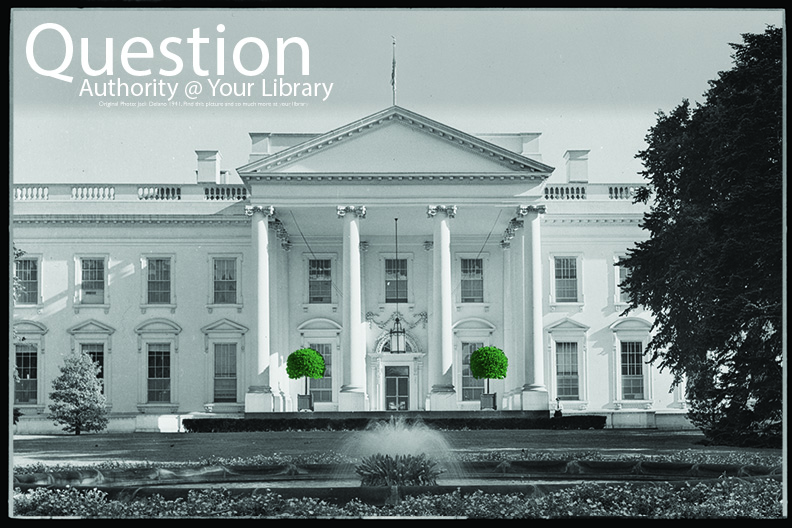
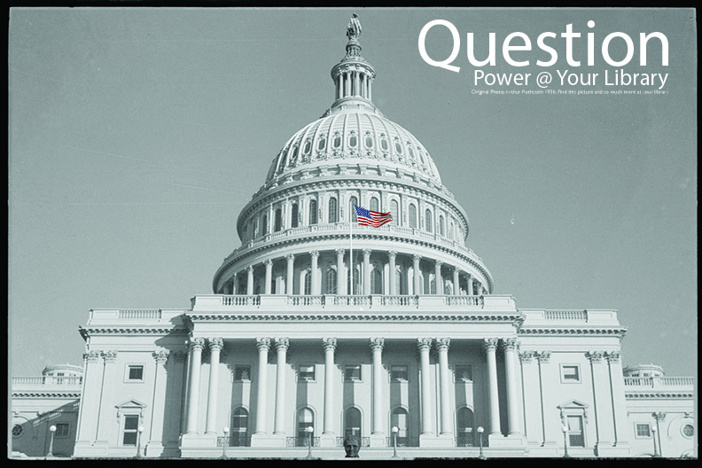
For a few years I have been talking about the need for “Question Posters.” Instead of READ posters that promote reading, we need a campaign to promote libraries and their focus on learning. So rather than talking about it and hoping someone takes up the task, I’m stepping up…if you want me to.
Below are three designs I put together for the posters. They are based on the amazing WPA collection at the Library of Congress. Please take the time to tell me if you would be interested in purchasing a poster (which ones), and whether you would support a Kickstarter campaign to make this happens. Unlike self-published books, posters are still best done printing in bulk and not on demand. That would take a big up front investment, and so I would need some sense folks would actually buy them.
I see these as 36″x24″ glossy poster selling for about $10 (hence the need to print in bulk).
[yop_poll id=”2″]
[yop_poll id=”3″]


I quite like the general idea of question posters, and I agree that they could be a great addition to the READ campaign.
These particular ones don’t do it for me, though — they look visually appealing, of course, but the images of stately government buildings aren’t in and of themselves, doing much to inspire a sense of questioning or doubt, or uncertainly (unless one is already inclined to associate pictures of government institutions with doubt, of course). Maybe some of the WPA images are less pretty? Or were shot from unusual angles — unusual enough to make the viewer think for a moment, “what IS that”?
Great ideas! I had some fun ones I included in my presentations and then met with the university copyright advisor (Amy is fantastic) who systematically destroyed them in terms of risk of litigation. However, looking for more interesting WPA photos is a fantastic idea.
I agree with what Galen Charlton said regarding the overall idea being fantastic. However, it’s not that the WPA images are “less pretty,” or even less “stately,” than the photographs used here, it’s that the imagery of WPA posters were illustrations. As illustrations the images were stripped down to their essence, mainly their designs, color, forms, white space, and typography, which all combined to stunning visual effect, and succinct communication of the message. Clearly, you have the message, and now it’s a matter of developing the imagery.
I would be interested to know what the other images were, and what the risks were based on those images.
You can see them in context here: http://t09.34d.myftpupload.com/?p=5363 In the screencast you can skip to 27:17 to see the discussion and examples.
Dr. Lankes, I just sent you an email. I would really love the opportunity to contribute to this project, as a librarian, a graphic designer, and as a believer in an informed citizenry.
Dave,
What an interesting concept. I’m wondering, though, if the images you have selected would have the opposite effect of what you are intending (or maybe you are actually intending to suggest that we should question the authority of the government, etc.). I can see an historical photo of children at work in the early 1900’s being used with “Question historical context @ your library” or something like that. I think if you dug deeper into the types of questions, rather than the broad ones you have used, or if your images were more personal and detailed, the posters might become more useful as teaching tools. I’ll keep thinking about it.
I feel a little dense admitting this, but when I first looked at them I read that you should question your library’s authority/justice/power. I wonder how it would look if the font treatment for “Question _____” was the same and on one line and “@ your library” stood alone below it?
Hi Dave, “promote libraries and their focus on LEARNING”; YES!!! I love this idea; I wonder if the “questions” might be more like active learning prompts like “Think” “Discover” “Invent” “Connect” “Make” “DO Science” that sort of thing, with images of the action? ….. without books and bookshelves in the image at all, they are there, its a library, but this is what is happening here, active learning, relationships, conversations…..
Love the idea. I wonder if there would be symbols that would be more international than US gov’t buildings. I would not hang these on my Learning Commons wall simply because they are so US specific.
I’d absolutely love one of each of these posters for my school library.
I think 3 feet by 2 feet is too big. There are not that many places where I could put that in the Library where I work.
Awesome idea! I would definitely purchase them. I would even go so far as to put them around my school and not just IN the library! 🙂
$10 each or set? Speaking as teeny, tiny library I’d love to see 1/2 size or pdf? Gorgeous.
How about this: http://pic.twitter.com/g00v4Hs5N3
I like the idea that they are questioning government, but for me in the UK the images are too US-centric. Would there be any objection to a group of UK librarians (the School Librarians’ Network) taking the idea and doing our own with UK images? I don’t think it would effect your market, but don’t want to steal your idea!
Steal away…just share what you come up with.